A pie chart is a circular graphic divided into slices representing the relative magnitude of items being plotted. Georeferenced pie charts provide information on the spatial distribution of the relative proportion of multiple constituents. The pie chart area can be scaled by the total concentration of these constituents to simultaneously relate the magnitude of the concentrations at these multiple locations.
View a training video on the generation of Pie Charts in EnviroInsite here.
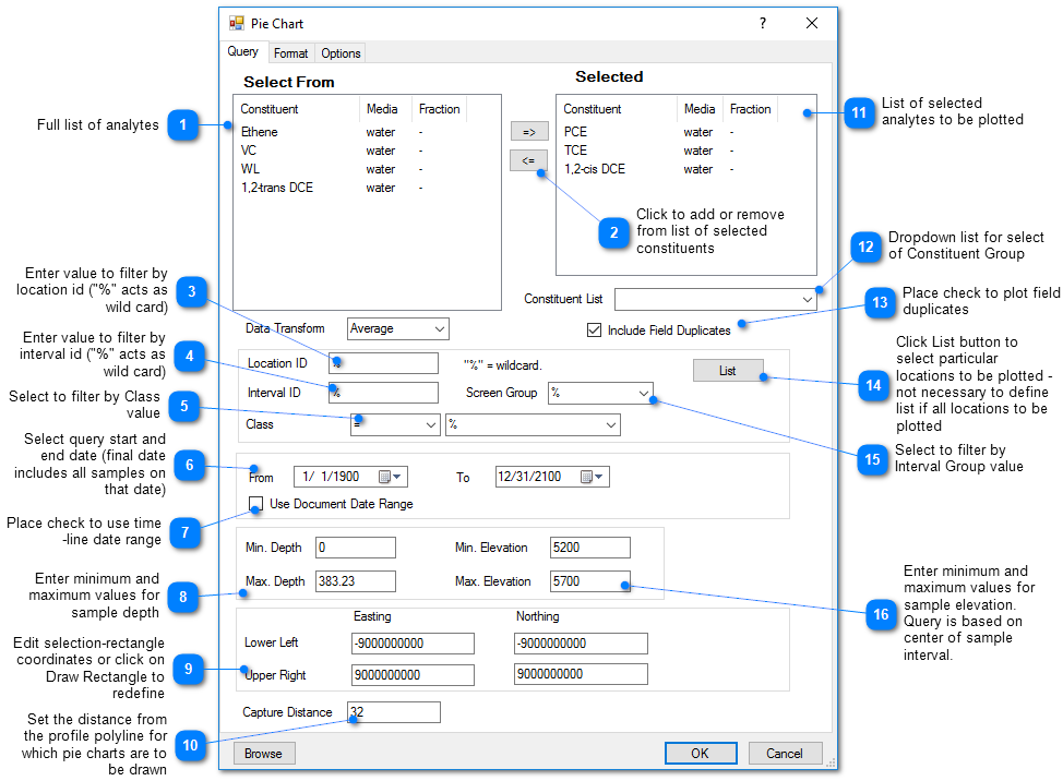
Click Plot> Data from the main menu and select Pie Chart. The Pie Chart dialog box opens. Modify the properties of the pie chart plot on the Query tab, Format tab, Options tab, and EQuIS Query tab as desired. Select the Apply button to see changes before saving. Click the OK button to save changes.
Query Tab

To add a constituent, select it in the left control window and click the button with the right arrow (=>) to move it to the list of selected constituents. To remove a constituent from the list of selected constituents, simply select the row and click the button with the left-arrow (<=).
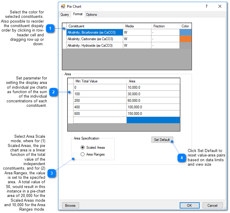
Format Tab
The pie chart area for each location is based on the total concentration of the selected constituents at that location. EnviroInsite provides two options for how the areas are obtained. With the Scaled Areas option, the total concentration at each location is calculated and the area is then interpolated based on the total concentration between the specified area-concentration value pairs. For the Area Ranges option, the values are binned so that pie charts between specified ranges are assigned the user-specified value. Rows in the Area table may be deleted by selecting the row header and hitting the delete button.

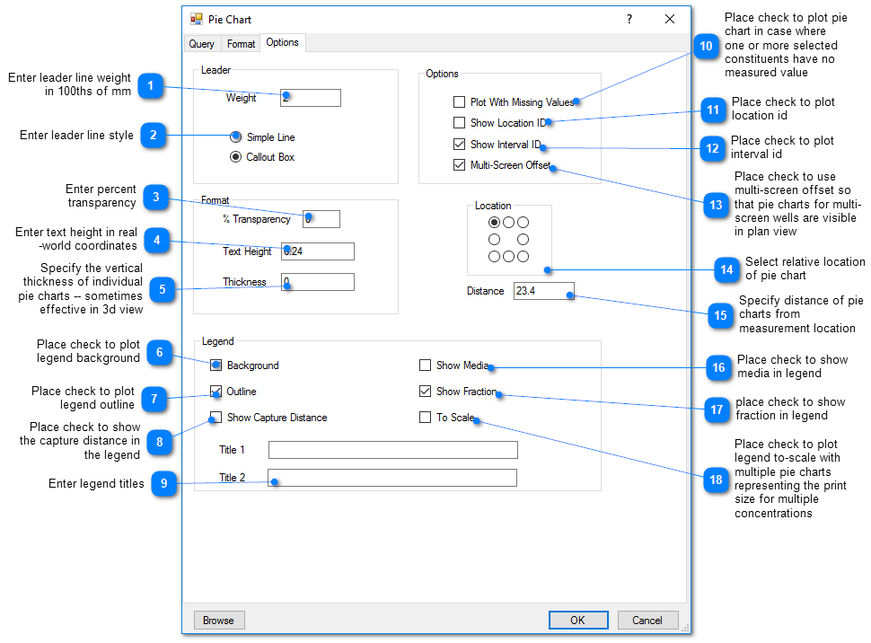
Options Tab
