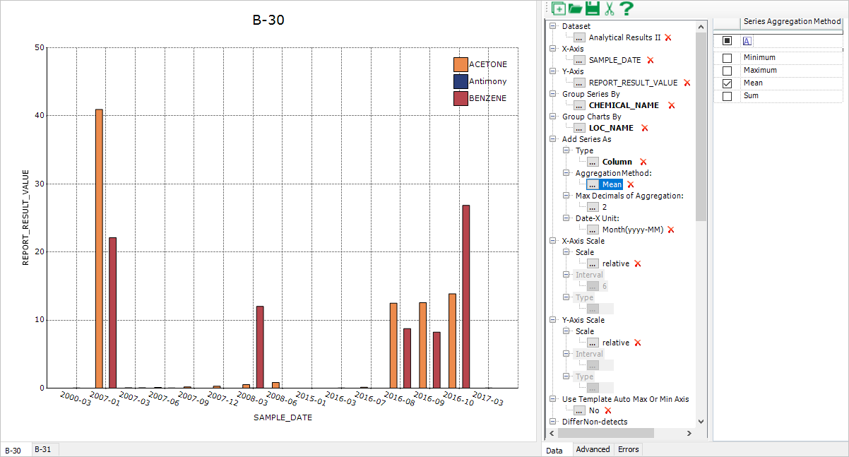
XY Charts can generate a chart of column type against the results of a report (e.g. Analytical Results Report) with a date type column (e.g. sample_date of ARII Report) being as X-axis. It calculates the results first, and then plots the calculated statistics, which are explained in the example below.
1.Run ARII with ACETONE, Antimony and Benzene (or other analytes you know) at B-30 and B-31 locations, and start XY Chart.
2.Select Group Series By = chemical_name, Group Charts By = loc_name, Add Series As = Column. Click Add Series to create charts (Figure 1).

Figure 1
Notes: •By default, Add Series As > AggregationMethod = Mean and Date-X Unit = Month(yyyy-MM). During plotting of the above example, XY Charts converts SAMPLE_DATE of X-axis from the M/d/yyyy hh:mm:ss of datetime format to yyyy-MM, calculates the averages of Y-axis values corresponding to each of X-axis yyyy-MM values, and plots the averages against the yyyy-MM values at the last. •The integer value of the Add Series As > Max Decimals of Aggregation: parameter is used to round the calculated Y-axis values of the Column Chart. •When Date-X Unit is selected as other than Default, the X axis data is of text type or the X axis is of category type. When Date-X Unit is selected as Default, the X axis data is of datetime type. •If X-axis labels overlap each other, their angles can be adjusted by selecting the Advanced Tab, then click on the X-axis area and selecting LabelRotate= True and LabelRotateAngle= 45 in the Advanced Tab. Currently, auto-adjustment to overlapped X-axis labels (HidePartialLabels=True and LabelIntersectAction = Rotate in the Advanced Tab after selecting the X-axis) are coded into building Column Chart. |